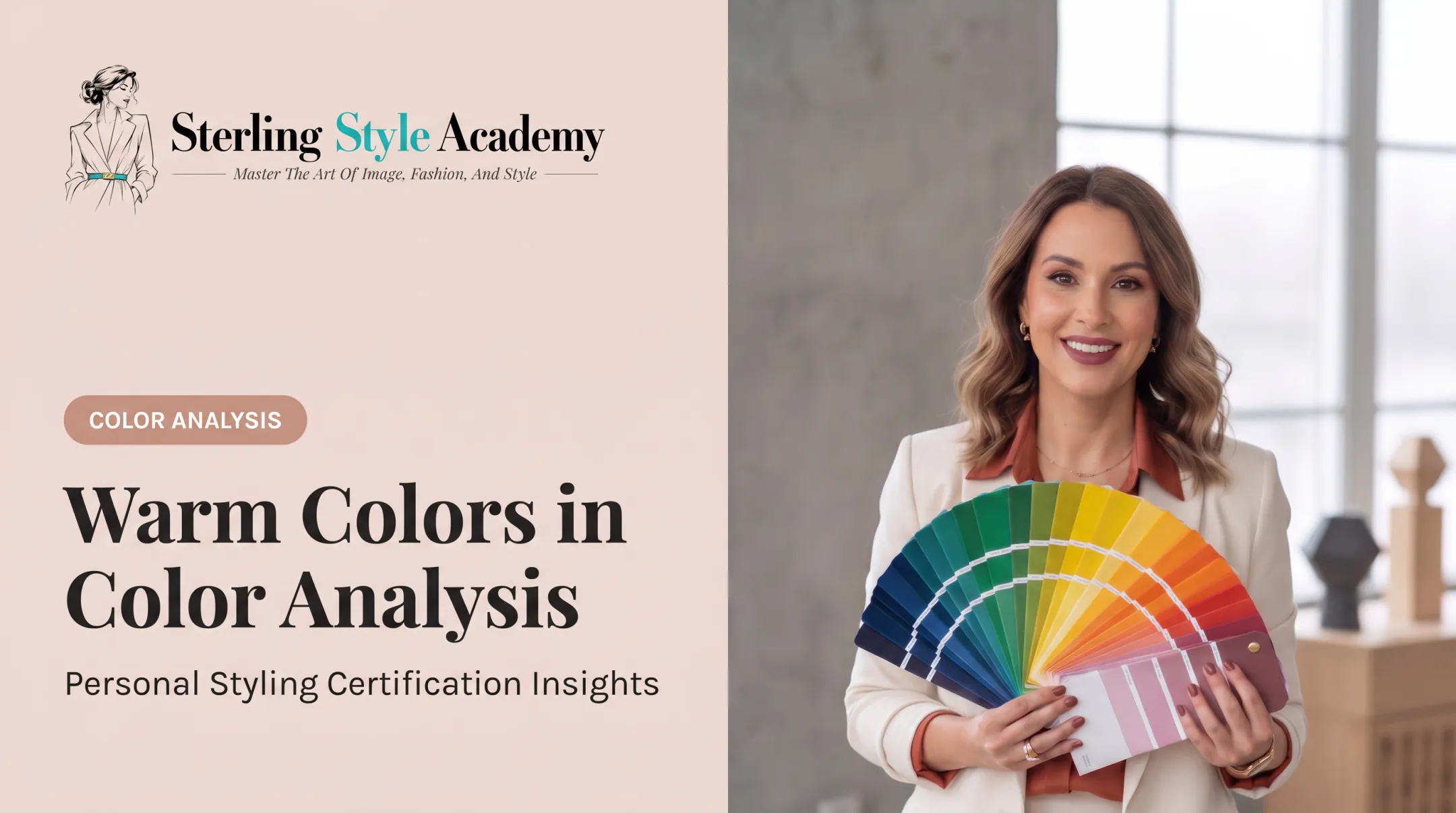
That's the exact problem personal color analysis solves. It's a method for identifying which colors flatter your specific skin, eye, and hair coloring, so you stop guessing and start dressing with intention.
This guide breaks down undertones, the seasonal color system, DIY versus professional analysis, and a few styling rules that make the whole thing easier to apply.
Key Takeaways
- Match clothing and makeup to your undertone, contrast, and chroma so colors actually flatter you
- Use the four-season model—and its 12 sub-seasons—for a more precise palette than broad categories alone
- Treat DIY quizzes as a start; professional analysis catches undertone and contrast details apps miss
- Know your palette to cut shopping time and reduce closet regret
What Is Personal Color Analysis?
Personal color analysis identifies which colors harmonize with your natural coloring, meaning your skin, eyes, and hair, to make your complexion look brighter and healthier rather than tired or flat.
The concept isn't new. It reached mainstream audiences in 1980, when a bestselling color guide sold roughly four million copies and spawned international licensing deals.
It faded from mainstream attention for decades, then came roaring back. #coloranalysis TikTok content drew more than 631 million views in January 2023 alone, with users testing filters that place their faces against different colored backdrops.
The Three Dimensions That Matter
Color analysis relies on three measurable factors:
- Hue/temperature – whether your coloring leans warm (golden, peachy) or cool (pink, blue)
- Value – how light or dark your natural coloring sits
- Chroma – whether your coloring reads as bright and clear, or soft and muted
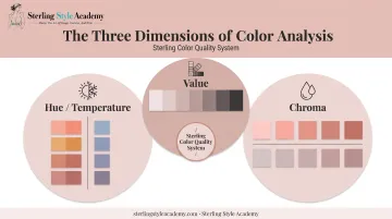
Color analysis is a technical read of your natural coloring. A "warm" classification says nothing about whether you're outgoing or introverted, and it doesn't touch body shape or personal style.
Why It Matters
Wearing the right colors reduces how much makeup you need to look put-together. The right shade near your face brightens your complexion on its own.
Trained image consultants use the same framework with clients worldwide as a technical skill, not a party trick. Once you know which colors support your coloring, wardrobe and makeup choices get simpler—and faster—to make.
Understanding Skin Undertones
Undertone is the tint beneath your skin, and it stays fixed regardless of a summer tan or winter paleness. Surface tone changes constantly; undertone doesn't. That stability is why undertone is the starting point for any color analysis.
There are three undertone categories:
- Cool – pink or blue tint beneath the skin
- Warm – golden or peachy tint beneath the skin
- Neutral – a mix of both, without a strong lean either way
Three Home Tests to Try
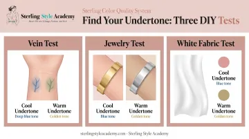
- Vein test – Check the veins on your inner wrist in natural light. Blue or purple veins suggest cool; green or olive veins suggest warm.
- Jewelry test – Hold gold and silver against your skin. If gold flatters you more, you likely lean warm; if silver does, you lean cool. This one's fairly subjective, so don't rely on it alone.
- White fabric test – Hold pure white fabric next to your face in bright natural light. If your skin looks rosy against it, you likely lean cool; if it looks sallow, you likely lean warm.
Run all three tests together. No single check is definitive on its own, so cross-referencing gives a more reliable read before you move on to a full seasonal palette. That is the same reasoning behind the SCQS, which scores several characteristics together instead of trusting one test.
The Four Seasons and 12 Color Sub-Seasons
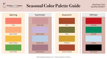
Each season combines undertone, value, and chroma into a signature palette. Sterling's guide to the winter palettes breaks down True, Bright, and Deep Winter the same way.
| Season | Temperature | Chroma | Value |
|---|---|---|---|
| Spring | Warm | Bright | Light |
| Summer | Cool | Muted | Light |
| Autumn | Warm | Muted | Deep |
| Winter | Cool | Bright | Deep |
- Spring wears coral, warm peach, golden yellow, and grass green well.
- Summer suits dusty rose, soft lavender, powder blue, and muted mauve.
- Autumn leans into rust, olive, mustard, and deep terracotta.
- Winter carries true red, emerald, icy blue, and stark black with ease.
Why 12 Sub-Seasons Exist
The basic four-season model works fine until it doesn't. Plenty of people sit between categories—warm but muted, or cool but bright. Forcing them into one of four boxes produces a palette that's close but not quite right.
That's why most professional analyses now use a 12-tone system, adding eight tonal spaces between the original four seasons. It accounts for chroma more precisely, which matters a lot for people with olive undertones or high-contrast features that don't fit neatly into "Winter" or "Summer."
Sterling Style Academy builds on that foundation with its Sterling Color Quality System (SCQS). SCQS still teaches 12-season color theory, then evaluates undertone, strength, clarity, and depth individually so each client gets a custom palette instead of a one-size-fits-all seasonal assignment.
How Is a Personal Color Analysis Done?
You've got two real paths: DIY or professional. Each has trade-offs worth knowing before you commit time or money.
DIY Methods
- Online quizzes – Fast and free, but based on self-reported answers about skin, eyes, and hair
- AI photo tools – Upload a photo, get an algorithm-generated result
- At-home draping – Hold fabric swatches near your face and compare
The catch with photo-based tools: a 2023 imaging study found that camera angle, distance, lighting, flash, and even file format all shift the measured color in a photo. Your phone's camera isn't a calibrated instrument, so results vary session to session.
Professional Draping
A trained consultant holds fabric swatches against your face in natural light, watching how your skin, eyes, and overall appearance shift with each one. It's a live, iterative process, not a single photo snapshot.
Consultants trained through structured programs, such as Sterling Style Academy's 2-Day Color Analysis Certification, learn undertone analysis, chroma and value assessment, and professional draping technique using the Sterling Color Quality System (SCQS). That training is what separates a quick guess from a repeatable, client-ready methodology.
Most professional sessions end with practical takeaways you can use right away:
- A personalized palette or color card for shopping
- Notes on which colors to avoid
- Guidance on applying the palette to makeup and accessories
Styling Rules That Pair Well With Color Analysis
Once you know your palette, two simple rules make outfit-building faster.
The 3-3-3 rule: Pick 3 colors, 3 textures, and 3 pieces per outfit. It keeps combinations cohesive without overthinking every choice.
The 70/20/10 rule: Structure an outfit as 70% dominant color, 20% secondary color, and 10% accent color. Think of a navy dress (70%), a tan cardigan (20%), and gold jewelry (10%).
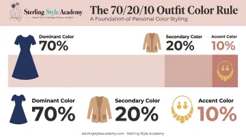
Combine either rule with your personal palette and outfit-building stops feeling random. You're choosing from colors that already work for you, then applying a structure that keeps the combination visually balanced.
Is Personal Color Analysis Worth It?
The practical upside is real: less decision fatigue while shopping, more confidence trying new pieces, and fewer "why did I buy this" items sitting unworn in your closet. That payoff compounds when the palette feeds an actual plan, which is what Sterling's capsule wardrobe service is built to do.
Whether that payoff justifies the spend depends on how you get analyzed and how much you already trust your eye.
What It Costs
Pricing varies widely by format:
- Free to low-cost DIY quizzes — Quick season guesses with no expert review; fine for curiosity, weak if your undertone is hard to read on camera
- Virtual photo-based analysis — Roughly $50 to $100 for a basic palette from submitted photos; convenient, but lighting and phone cameras can skew results
- Live virtual consultations — About $347 to $597 depending on depth, sometimes bundled with a closet review; stronger when you want real-time draping feedback
- In-person sessions — Generally $150 to $500, with examples like a $297 Color Express session in New York or a comparable 90-minute session in Dubai
For many shoppers, a one-time paid analysis costs less than a season of unused clothes. Providers such as Sterling Personal Styling offer virtual and in-person color and wardrobe sessions in that mid range when you want guided results instead of a quiz.
The Limitation Worth Remembering
Color analysis is a guide, not a rulebook. If a "wrong" color makes you happy, wear it anyway—preference still gets the final vote. When you want a definitive answer rather than guesswork, Sterling runs an online color analysis consultation with a trained analyst.
Frequently Asked Questions
How much does a color analysis typically cost?
Prices range from free online quizzes to $50 to $100 for basic virtual assessments, up to $150 to $500+ for in-person professional sessions. Cost depends on session depth, format, and consultant expertise.
How can I identify my skin undertones?
Try three home tests: check if wrist veins look blue (cool) or green (warm), see if gold or silver jewelry flatters you more, and compare your skin against white fabric in natural light. Use all three together for a reliable read.
Is color analysis really worth it?
It's worth it if you want faster, more confident shopping decisions and fewer wardrobe mistakes. Just remember it's a guide based on color science, not a strict rule you have to follow every time.
What is the 3 color rule for clothes?
The three-color rule suggests limiting an outfit to no more than three coordinated colors. It keeps looks cohesive without appearing overly busy or mismatched.
What is the 3-3-3 rule for clothes?
This rule pairs 3 colors, 3 textures, and 3 pieces to build a simple, balanced outfit. It's a quick framework for avoiding overcomplicated combinations.
What is the 70/20/10 rule for colors?
Structure an outfit with one dominant color at 70%, a secondary color at 20%, and an accent color at 10%. It creates visual balance without requiring color theory expertise.